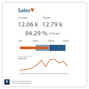
How does your organization define and display its metrics? I believe many organizations are not defining and displaying metrics in a way that benefits them most. If an organization goes through the trouble of measuring and reporting on a metric, the analysis ought to include all the information needed to evaluate that metric effectively. A number, by itself, does not provide any indication of whether the result is good or bad. Too often, the reader is expected to understand the difference, but why leave this evaluation to chance? Why not be more explicit about what results are expected?
Incorporating information about expected results will enable your organization to transform from merely measuring performance with metrics to managing performance with key performance indicators (KPIs). This approach will also create consistency in how information is evaluated and communicated.
The definition of every metric should include five components:
- Value
- Units
- Time period
- Target
- Thresholds of performance
In order to use a metric as a KPI, it should include a visual representation of all these elements plus:
- Whether the target was met
- Trend over time
- Variance at a lower level
Let’s look at each metric, starting with the value. Most organizations think of a metric as a numerical value which could represent either a collected data point or a calculation based on other data, for example “sales”.
But what units are represented in sales? It could be the number of units sold or it could be the revenue generated (units times price). The definition and the display should make these elements clear.
The viewer also needs to understand the time period covered by the metric. A thousand dollars might be a “good” value for an hour of sales, but it’s probably not a good value of sales for the year.
Equipped with this information, the viewer should have a clear understanding of what the value represents. However, they still have no information about whether this is a good result. Every metric should include a targeted, planned or budgeted value. Sometimes organizations maintain the original targeted/planned/budgeted value as well as the current projected value based on what is known about the performance of the organization to date and the market conditions that now exist. With this information, an organization can begin to make a determination of how well it is performing. If “sales” met or exceeded the target, the result is “good.”
 There should be a visual indication that the target was met. What if the target was missed, but reached 98%? That’s a better result than 75%. This is where thresholds come in. Organizations should establish levels of performance that indicate the severity of a missed target. For instance, hitting 95-99% of the sales target may not cause alarm, but below 95% is a red alert. Again, a visual indication of where in the range the metric falls is helpful. Often this is done with “stop lighting” or red/yellow/green color coding, but a gauge is even better since the color coding doesn’t indicate whether the metric is close to the boundary. User experience designers should note that broader accessibility to information across the organization also suggests that color coding would be non-inclusive for those with visual impairments.
Regardless of whether the target was met, the organization’s performance may be declining. Therefore, some indication of the trend over time is important. For example, if the last three periods have all shown declining values, there may be cause for alarm even though the target was met. Spark lines or micro charts are an effective way to show the trend over time. Other techniques include an up or down arrow to indicate how the current metric compares to the prior time period.
Finally, it’s important to know if any unfavorable variances are hiding in the lower levels of the data. A large favorable variance in sales of widgets may be offsetting a large unfavorable variance in sales of gadgets. Using the techniques above, it would be easy to see if any values fall into the unacceptable range. Variances should be surfaced with a visual indicator so the reader isn’t lulled into a false sense of security that everything is okay. A common technique is a red/yellow/green dot near the metric based on the lower-level variances. Another technique is a small triangle (also color coded) pointing up if the variances are favorable and pointing down if the variances are unfavorable.
Interestingly, metrics that are enhanced this way also provide the foundation for natural language generation (NLG) of text describing how the organization is performing. As the industry evolves toward increased use of conversational computing, these enhanced metrics create the basis for meaningful narratives that can communicate performance relative to the organizations goals.
The definition and display of metrics may seem like a remedial topic. However, many of the products we evaluate in the Analytics and Data Value Index do not support all these capabilities out of the box. In many cases, you can customize the products to convert your metrics into true key performance indicators and I encourage you to do so, but hopefully the vendors will also realize the importance of these capabilities and incorporate them into their products to help your organization go beyond merely measuring its performance to managing it.
Regards,
David Menninger

 There should be a visual indication that the target was met. What if the target was missed, but reached 98%? That’s a better result than 75%. This is where thresholds come in. Organizations should establish levels of performance that indicate the severity of a missed target. For instance, hitting 95-99% of the sales target may not cause alarm, but below 95% is a red alert. Again, a visual indication of where in the range the metric falls is helpful. Often this is done with “stop lighting” or red/yellow/green color coding, but a gauge is even better since the color coding doesn’t indicate whether the metric is close to the boundary. User experience designers should note that broader accessibility to information across the organization also suggests that color coding would be non-inclusive for those with visual impairments.


